

A slider allows users to select a value from a specified range by dragging a thumb along a track. In Next.js, you can easily add a slider using the react-range package.
Approach
To add a slider in a Next.js application, we are going to use the react-range package. This package provides a customizable slider component. First, install the package, then import the Range component and use it inside your page.
Steps to Add Slider in Next.js
Prerequisite: Before following this tutorial, make sure you have already created a Next.js project. If not, refer to the Next.js Installation and First Application article.
Step 1: Install the required package
Run the following command inside your project directory:
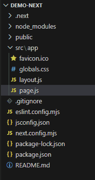
npm install react-rangeProject Structure: It will look like this.
Step 2: Add the Slider
Open the src/app/page.js file and add the following code.
// File Path: src/app/page.js
"use client";
import { useState } from "react";
import { Range } from "react-range";
export default function Home() {
    const [values, setValues] = useState([50]);
    return (
        <main
            style={{
                display: "flex",
                flexDirection: "column",
                justifyContent: "center",
                alignItems: "center",
                minHeight: "100vh",
                gap: "30px",
                width: "100%",
            }}
        >
            <h2>
                Next.js Slider -
                GeeksforGeeks
            </h2>
            <div style={{ width: "300px" }}>
                <Range
                    step={1}
                    min={0}
                    max={100}
                    values={values}
                    onChange={setValues}
                    renderTrack={({ props, children }) => (
                        <div
                            {...props}
                            style={{
                                ...props.style,
                                height: "6px",
                                width: "100%",
                                backgroundColor: "#ccc",
                            }}
                        >
                            {children}
                        </div>
                    )}
                    renderThumb={({ props }) => (
                        <div
                            {...props}
                            style={{
                                ...props.style,
                                height: "20px",
                                width: "20px",
                                borderRadius: "50%",
                                backgroundColor: "#0070f3",
                            }}
                        />
                    )}
                />
            </div>
            <p>
                Selected Value: {values[0]}
            </p>
        </main>
    );
}
Explanation: Here, we first import the Range component from the installed package and the useState() hook from React. We then create a state variable to store the selected slider value. The Range component displays a slider between the minimum and maximum values. Whenever the slider thumb is moved, the onChange() function updates the selected value and displays it on the page.
Step 3: Run the application
Run the below command in the terminal to run the app.
npm run devOutput:

